How To Utilize Texture Successfully In Your Design Projects
One of the most ubiquitous problems that web designers have to solve is that pervasive look of flatness and vector overload. One of the easiest ways to overcome this issue is to add some texture; whether it’s a subtle stippling or a striking pattern, it really helps to add dimensionality, as well as emphasize certain elements and add originality.
Due to a recent history of overbearingly grungy styles, sometimes texture is maligned as a fad that should be put to rest. But a thoughtful use of texture makes a big improvement to a design; it’s all in how you use it. It’s a tool that will yield great results if you have a firm command of the right principles to employ, so make sure that you’re using it in the best way possible for your work.
 One of the most understated ways to add a bit of texture is to add a noise effect to flat fields. Often done on the backgrounds of sites, this technique is great for when you want to add texture without sacrificing a clean look. Web Design WordPress Theme demonstrates the extremities of subtlety you can take texture to, by just barely adding some interplay of shades in the blue surfaces of the design. On the other end of the spectrum, this website provides a good example of how even a slight texturing technique like noise can be too much when it’s used on every element. The typography and images would stand out much more from the background if one or the other were smooth.

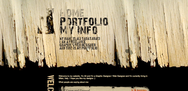
 Another common type of texture is the imitation of recognizable surfaces, like wood grain or fabric. This technique is applied to good effect with this website, which would look sterile and boring without the addition of a soft paper-grain effect. Wood textures are also a popular choice, although they’ve become popular enough that a straightforward treatment looks dull and unoriginal.
 Try mixing it up to keep your designs looking fresh.

 Although it’s gotten an understandably bad rap in the past, the new grunge is different; the understated, vintage-style descendant of past versions. For example, this website shares many similar attributes with the first example, including the color palette, and use of texture in both the typography and background. Its success lies in the low contrast of the background, that makes the texture just a light finishing touch, and the readability of the typography; it isn’t hindered by its textural quality.

 On logos, headlines, and other header elements: This can look especially good when paired with a contrasting background; the texture really helps to make the logo look interesting.
 Paired with other dimensional qualities: This website uses a letterpress effect (you can use this letterpress tutorial to make your own) on its navigational elements, which ties in nicely with the textured background.
On icon sets: There are far too many icons that look exactly the same as every other vector out there. Adding texture to your icons can make them striking and memorable.
Paired with other dimensional qualities: This website uses a letterpress effect (you can use this letterpress tutorial to make your own) on its navigational elements, which ties in nicely with the textured background.
On icon sets: There are far too many icons that look exactly the same as every other vector out there. Adding texture to your icons can make them striking and memorable.
 As long as you keep in mind that a little texture goes a long way, it’s safe to say that almost any style or combination can work. You’ll find that if you add subtle textures to your design arsenal, it will result in work that has that extra little something that makes a site feel more vibrant, interesting, and unique.
What is Texture?
Textures are occasionally confused with patterns and background images; for the most part patterns should be seen as small units that repeat seamlessly, and images as having more focal points and details than textures. However, all three of the terms sometimes overlap. Patterns and images can work to add texture to a web design, so although they’re not part of the classical definition of the word, they can be included in many discussions of the use and importance of texture.Noise
One of the most understated ways to add a bit of texture is to add a noise effect to flat fields. Often done on the backgrounds of sites, this technique is great for when you want to add texture without sacrificing a clean look. Web Design WordPress Theme demonstrates the extremities of subtlety you can take texture to, by just barely adding some interplay of shades in the blue surfaces of the design. On the other end of the spectrum, this website provides a good example of how even a slight texturing technique like noise can be too much when it’s used on every element. The typography and images would stand out much more from the background if one or the other were smooth.
Natural
Another common type of texture is the imitation of recognizable surfaces, like wood grain or fabric. This technique is applied to good effect with this website, which would look sterile and boring without the addition of a soft paper-grain effect. Wood textures are also a popular choice, although they’ve become popular enough that a straightforward treatment looks dull and unoriginal.
Try mixing it up to keep your designs looking fresh.
Grunge
Although it’s gotten an understandably bad rap in the past, the new grunge is different; the understated, vintage-style descendant of past versions. For example, this website shares many similar attributes with the first example, including the color palette, and use of texture in both the typography and background. Its success lies in the low contrast of the background, that makes the texture just a light finishing touch, and the readability of the typography; it isn’t hindered by its textural quality.
Effective Techniques
The examples above have shown that many different types of texture can work really well, if used with consideration and restraint. But there are plenty of other design elements that can benefit from the addition of texture:
On logos, headlines, and other header elements: This can look especially good when paired with a contrasting background; the texture really helps to make the logo look interesting.
Paired with other dimensional qualities: This website uses a letterpress effect (you can use this letterpress tutorial to make your own) on its navigational elements, which ties in nicely with the textured background.
On icon sets: There are far too many icons that look exactly the same as every other vector out there. Adding texture to your icons can make them striking and memorable.
As long as you keep in mind that a little texture goes a long way, it’s safe to say that almost any style or combination can work. You’ll find that if you add subtle textures to your design arsenal, it will result in work that has that extra little something that makes a site feel more vibrant, interesting, and unique.

Author Bio
Luke Clum is a Seattle based graphic designer and web developer.